Rough Draft VS Final Draft
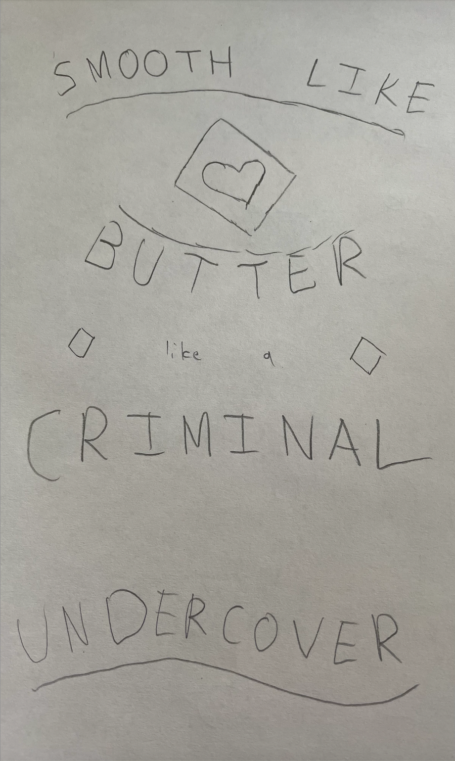
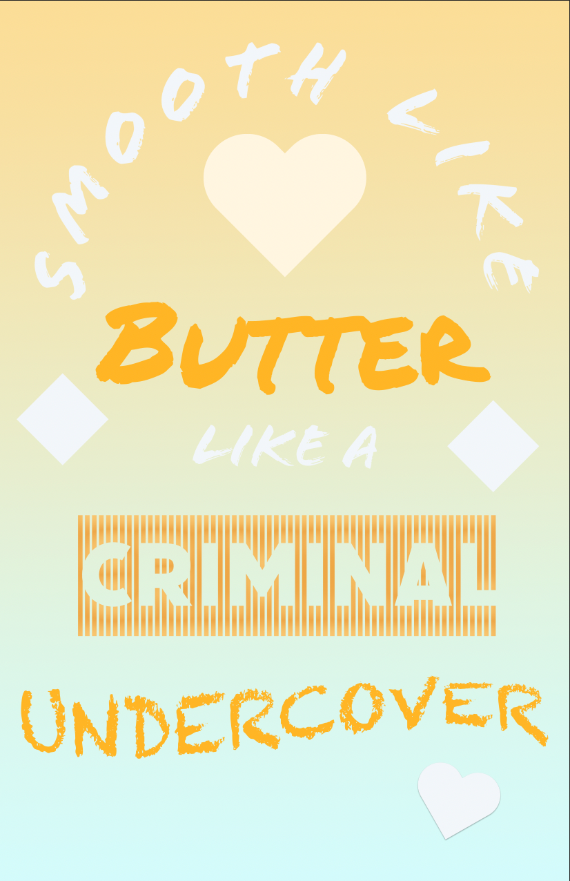
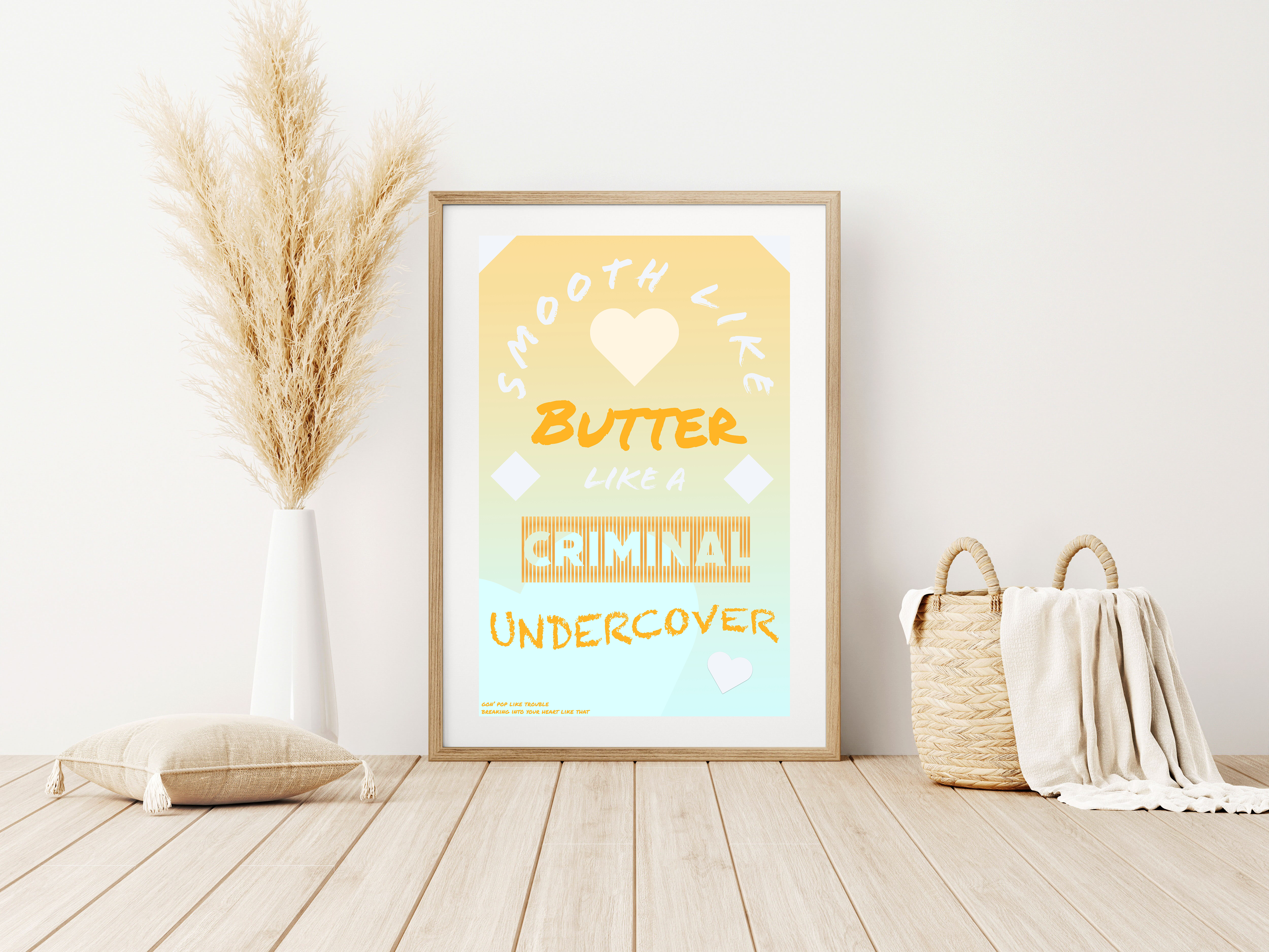
I took inspiration from one of the samples provided. I recognized the lyrics from the BTS song “Dynamite,” so I decided to try making a typography poster for one of their other English songs, “Butter.” I also wanted to try using one of the more colorful gradients, so I chose one in yellow and blue since it was the closest to the original aesthetic of the song.
The song is meant to be lighthearted, so I went with a brighter color palette that leaned more towards warmer colors. I chose to stick with yellow and orange, as I felt that red would be a bit intense compared to the rest of the colors that were being used and would contrast too much from the rest of the color palette. I also leaned more towards calligraphy fonts, since they had a more fun and cheerful appearance compared to some of the other formal fonts. The only exception is the font for “Criminal,” which I wanted to use the font with lines as they vaguely resemble prison bars.
The text is either in orange or white, which were colors that both matched the general color palette and contrasted it enough that they were relatively visible. I also added some hearts and squares, since the cover designed for “Butter” features a heart and butter is often cut into squares. I also decided to stick with either white or colors that were light, in order to match the aesthetic of the rest of the poster and to add a bit of decoration outside of just the typography. One of the hearts also has a shadow effect applied onto it, which appears just underneath it. I wanted to test some of the other layer options and it looked cool, so I kept it that way.