Stationary Project and Logo (ADV-95)
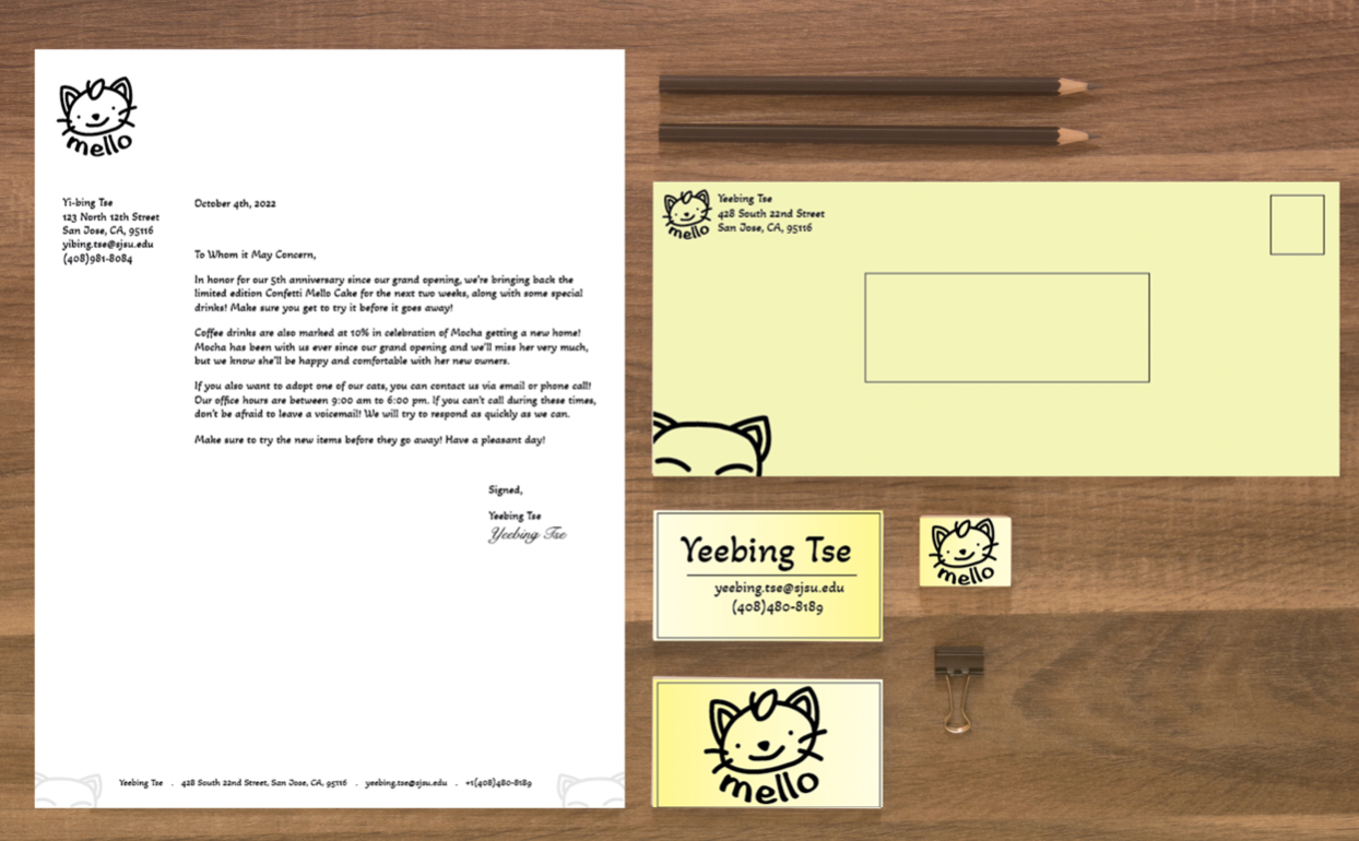
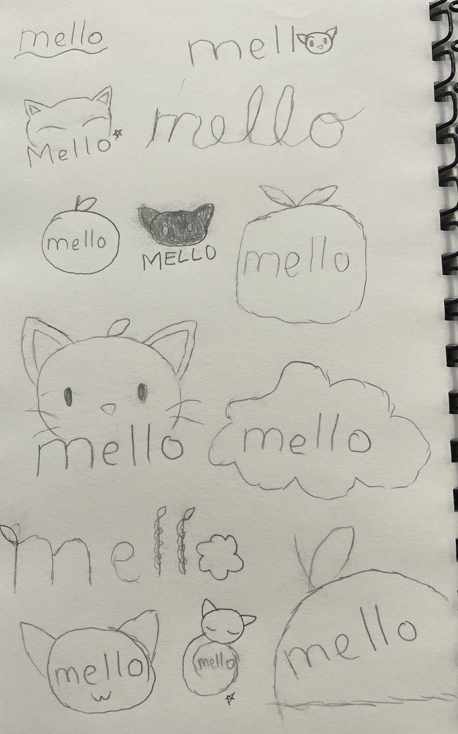
The name of this company is “Mello,” a fictional cat cafe. The target audience are people who like cats and enjoy a bright and cheerful atmosphere, since the former is the main appeal for cat cafes in the first place. The mission of the cafe is to create a welcoming and cheerful atmosphere for customers to enjoy with their food.
Due to these specifics, I wanted to use the color yellow for the envelope and the business cards, as well as the archived logo for the cafe as decoration for the envelope and the letterhead. The color yellow is connected to happiness and positivity, and bright colors gave the envelope and business card a more lighthearted feeling. I also chose to reuse an archived logo from the previous assignment, as its design looked like it would be good at filling up some of the negative space within the letterhead and envelope, giving it some more personality. In my opinion, it matched the cheerful and lighthearted tone that I was going for, while also adding to the fact that the company has a connection to cats.
The logo that I went with is a cartoonishly designed face of a cat, along with the name of the company under it, formatted with a lower arch. I went with this logo because it looked the most friendly yet detailed of the three logo choices I had, and the words were edited to revolve around it. I also chose the specific font that I went with for both the logo and the letterhead in order to make them match. Although the font itself is not considered to be a font that is normally used for letters, I felt like it gave it a nice, laid-back feeling to it while still being easy to read.